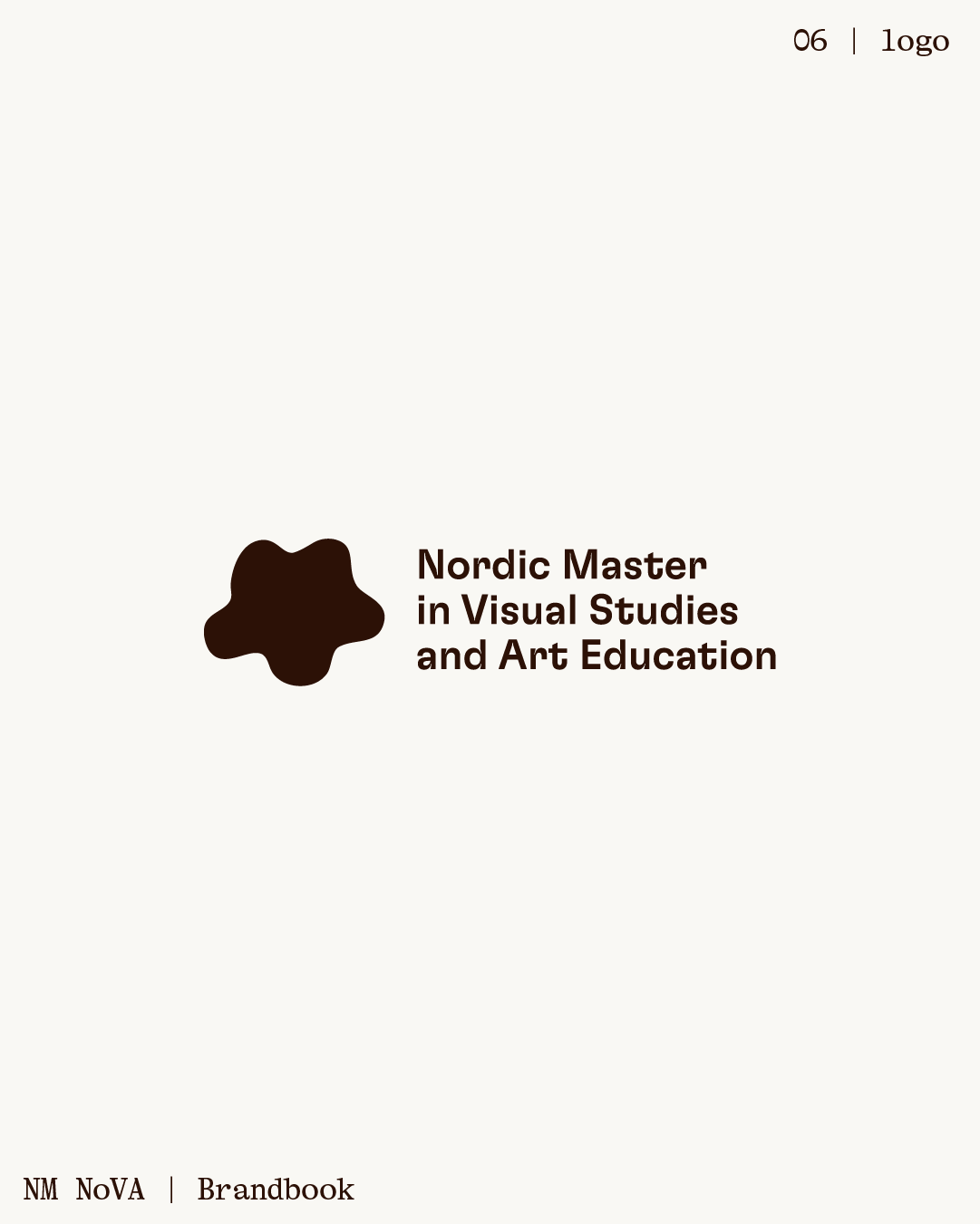
NM NoVA is a joint master’s program in Nordic Visual Studies between Aalto University (Finland) and Aalborg University (Denmark). This visual identity proposal aimed to reimagine how the program presents itself, visually and emotionally.
This project was completed with the support of designer Laura Rajalin.
We began with a thorough analysis of NoVA’s existing identity and communication efforts. This helped us understand the program’s current state and form the foundation for a renewed communications plan. From there, we developed multiple creative strategies, one of which included this rebrand proposal.
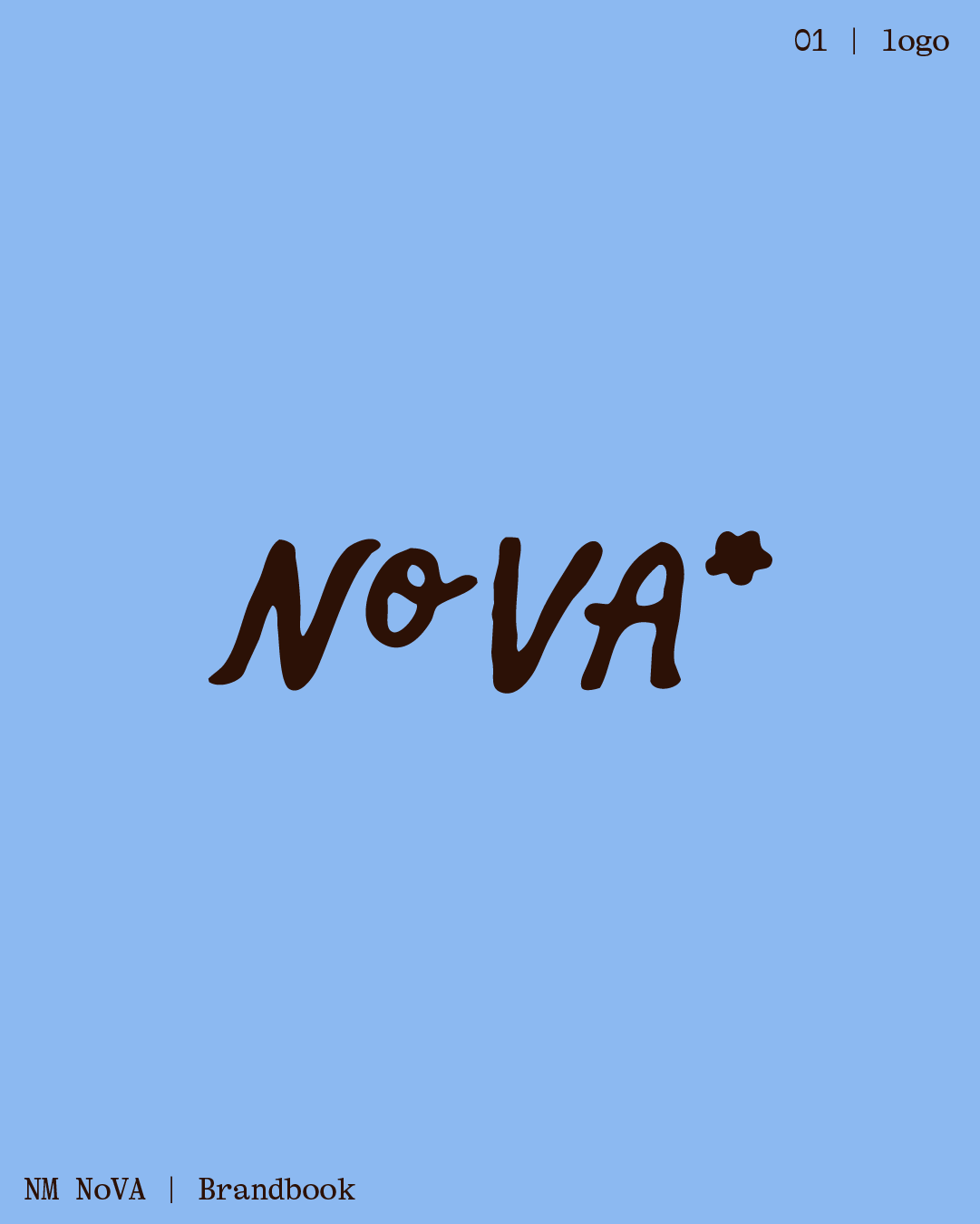
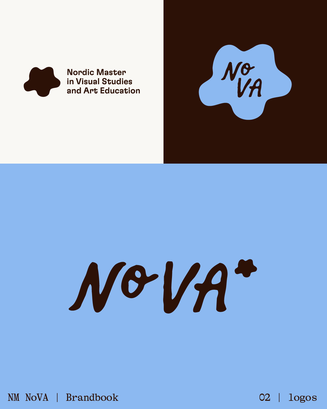
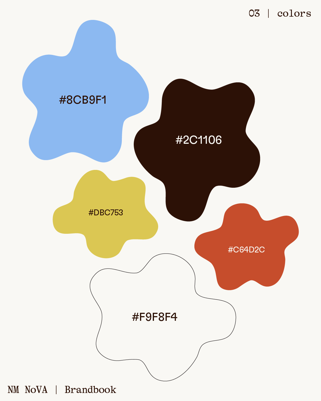
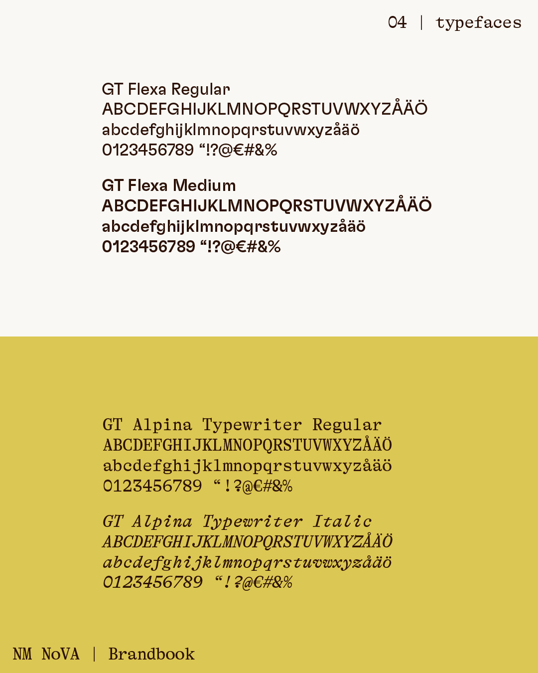
This proposal builds on the original visual identity by Katri Astala. We respected the foundation she created, continuing to use the same fonts and many of her illustrations. The updated color palette was also inspired by her work.
At the core of the rebrand were two key questions:
1. How might we visually represent the uniqueness of a program where students study in two different countries, yet belong to one community?
2. How might we make the brand feel more alive and foster a stronger sense of belonging?

Our guiding compass throughout the design process were the values we identified as essential to NoVA: curiosity, openness, care, equality, sustainability, and Nordic heritage. These values informed a number of creative choices:
1. Dynamic elements such as subtle motion and animation to make the brand feel more alive.
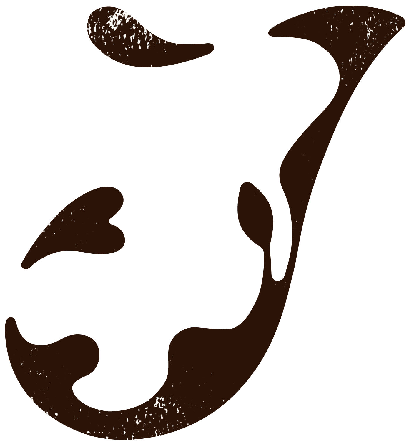
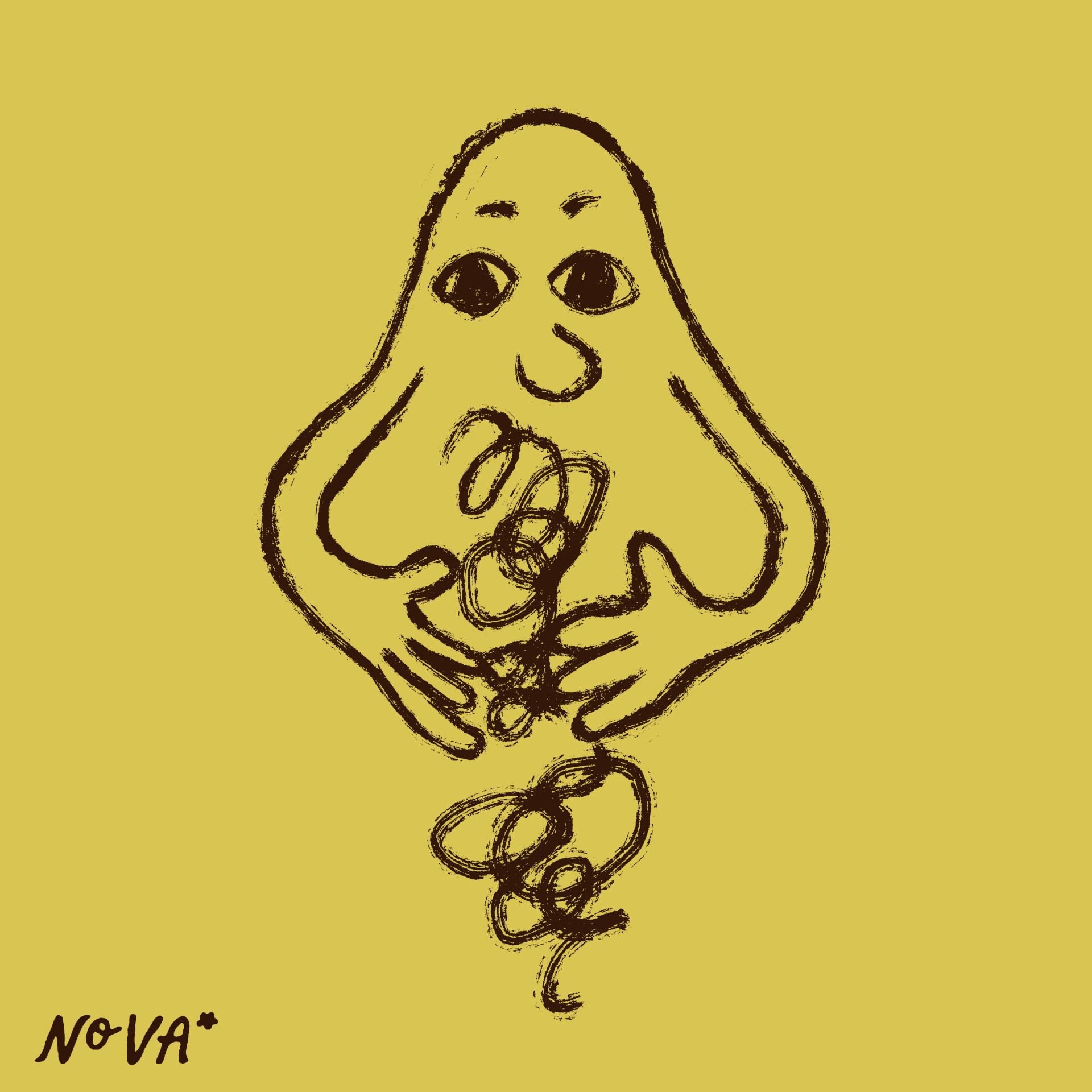
2. Hand-drawn graphics to add warmth and a human touch.
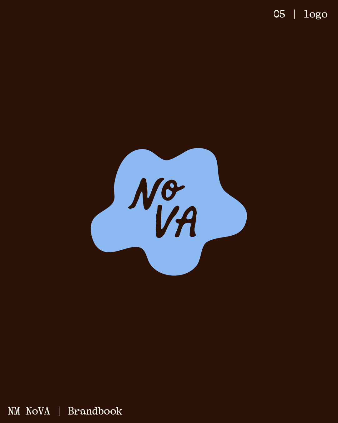
3. A friendlier logo with a few variations for flexibility.
4. A more vibrant color palette
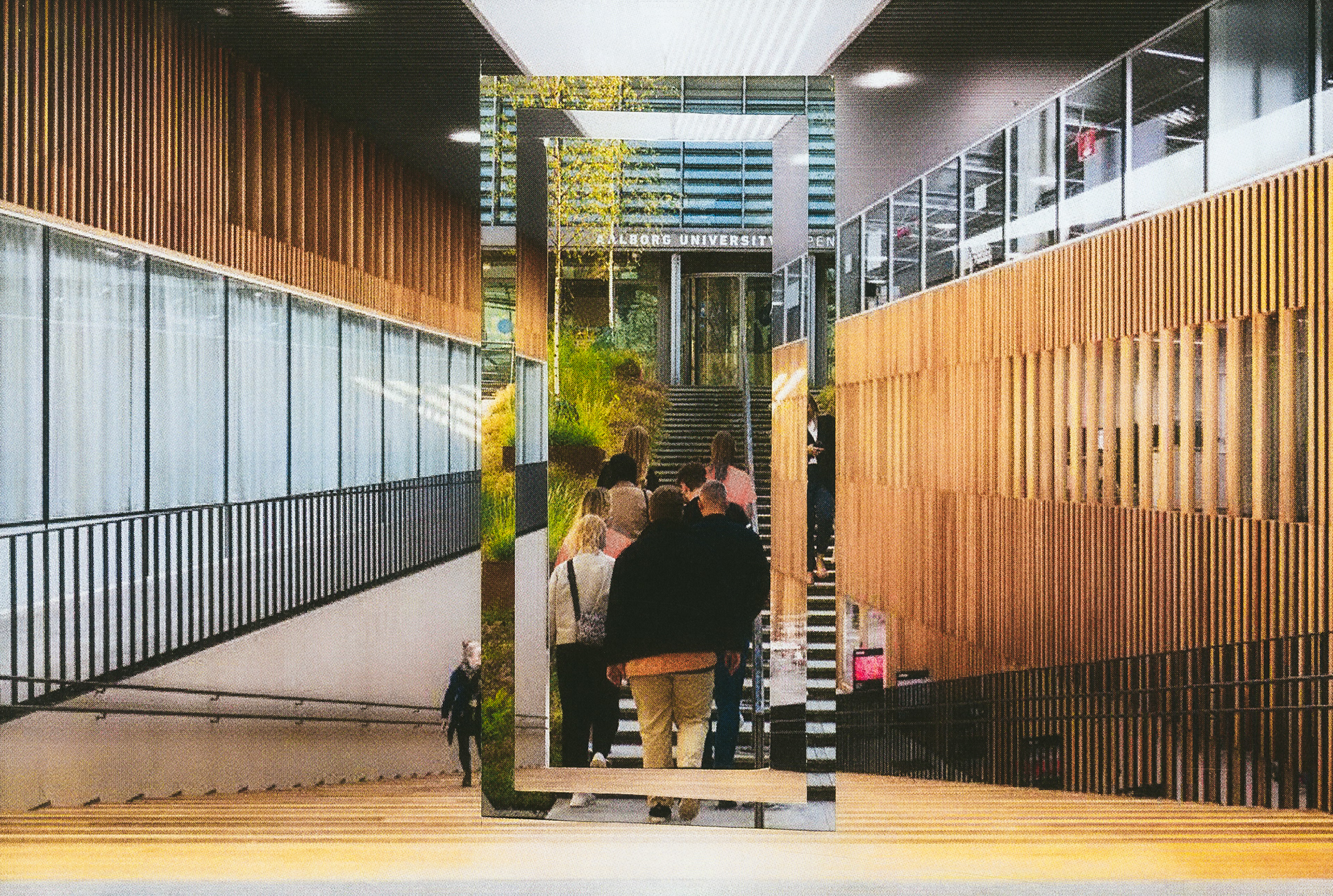
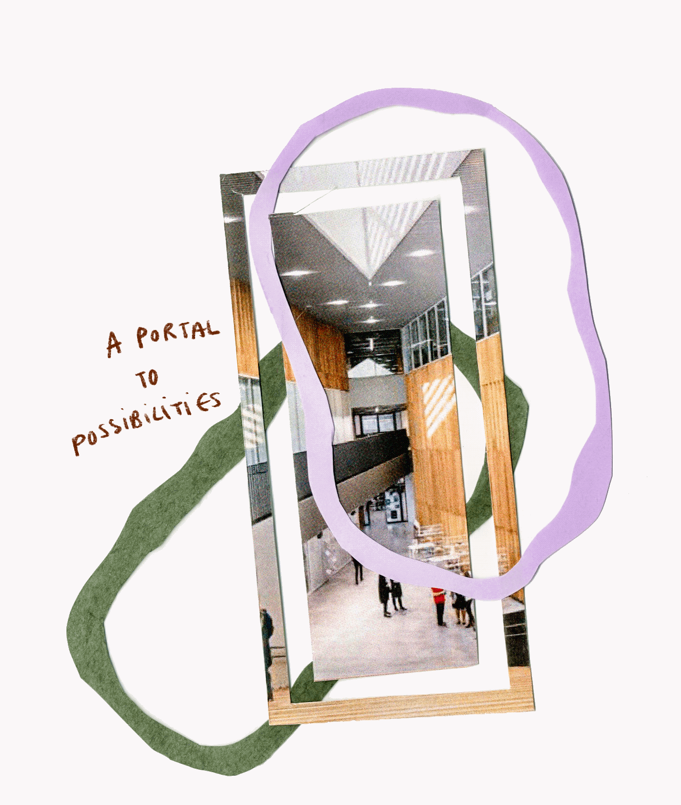
5. Visual elements that reflect duality and unity, highlighting that the program takes place across two universities, yet forms one tightly-knit community.
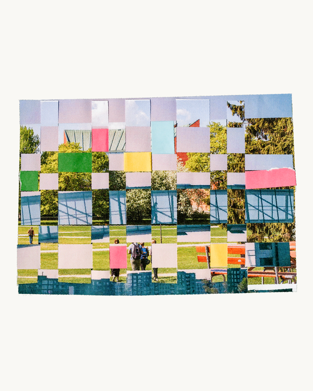
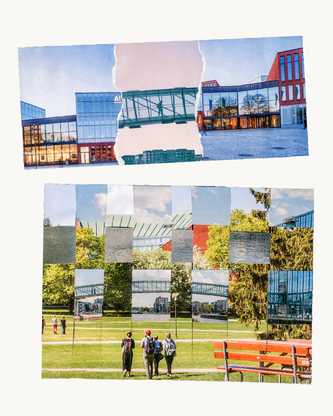
Visual experiments in the form of collages were a key part of the project. We played around with paper textures and photographs from both Aalto University and Aalborg University’s Copenhagen campus to create a series of compositions that encapsulate the idea of a dual-location program and an interwoven, connected community.
These animation tests explore how to bring the brand to life (almost literally) while also introducing a warm, hand-made feel.
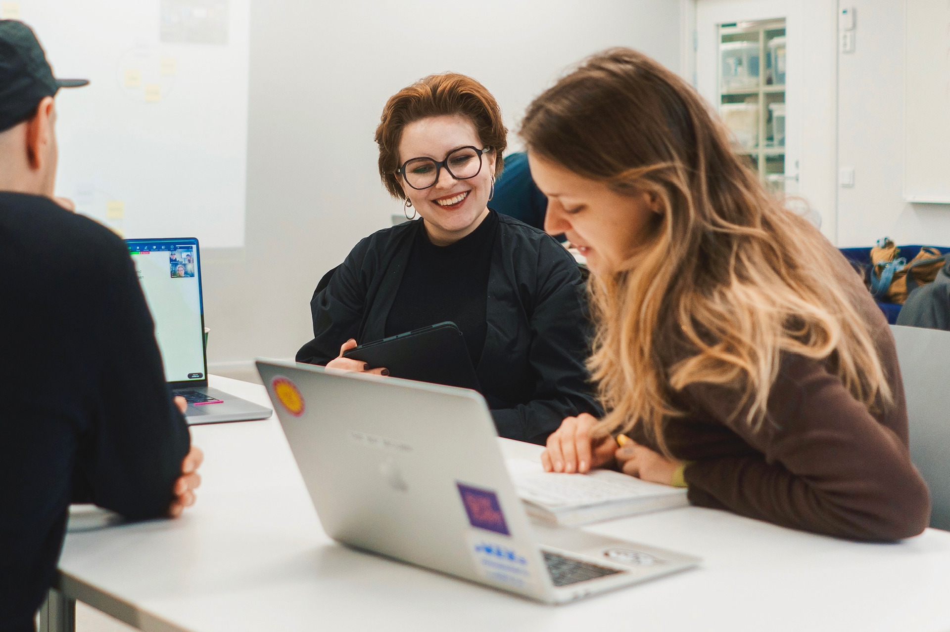
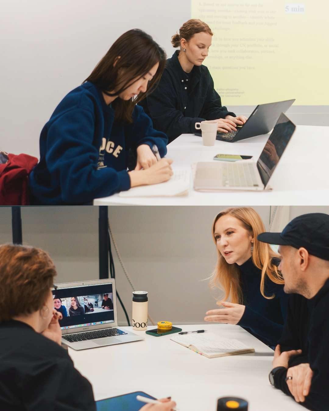
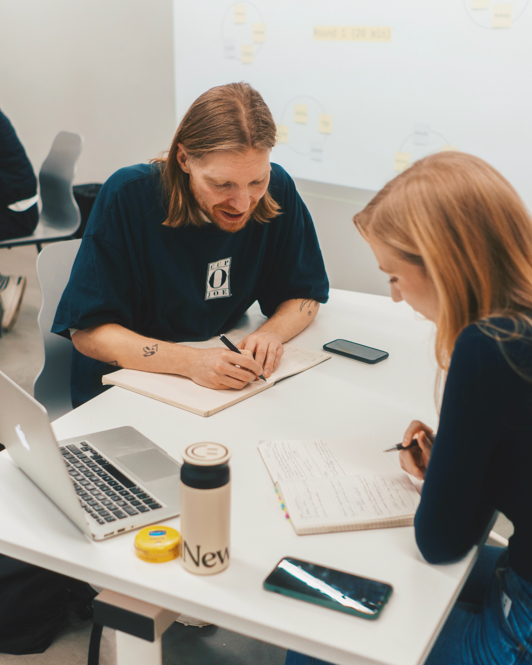
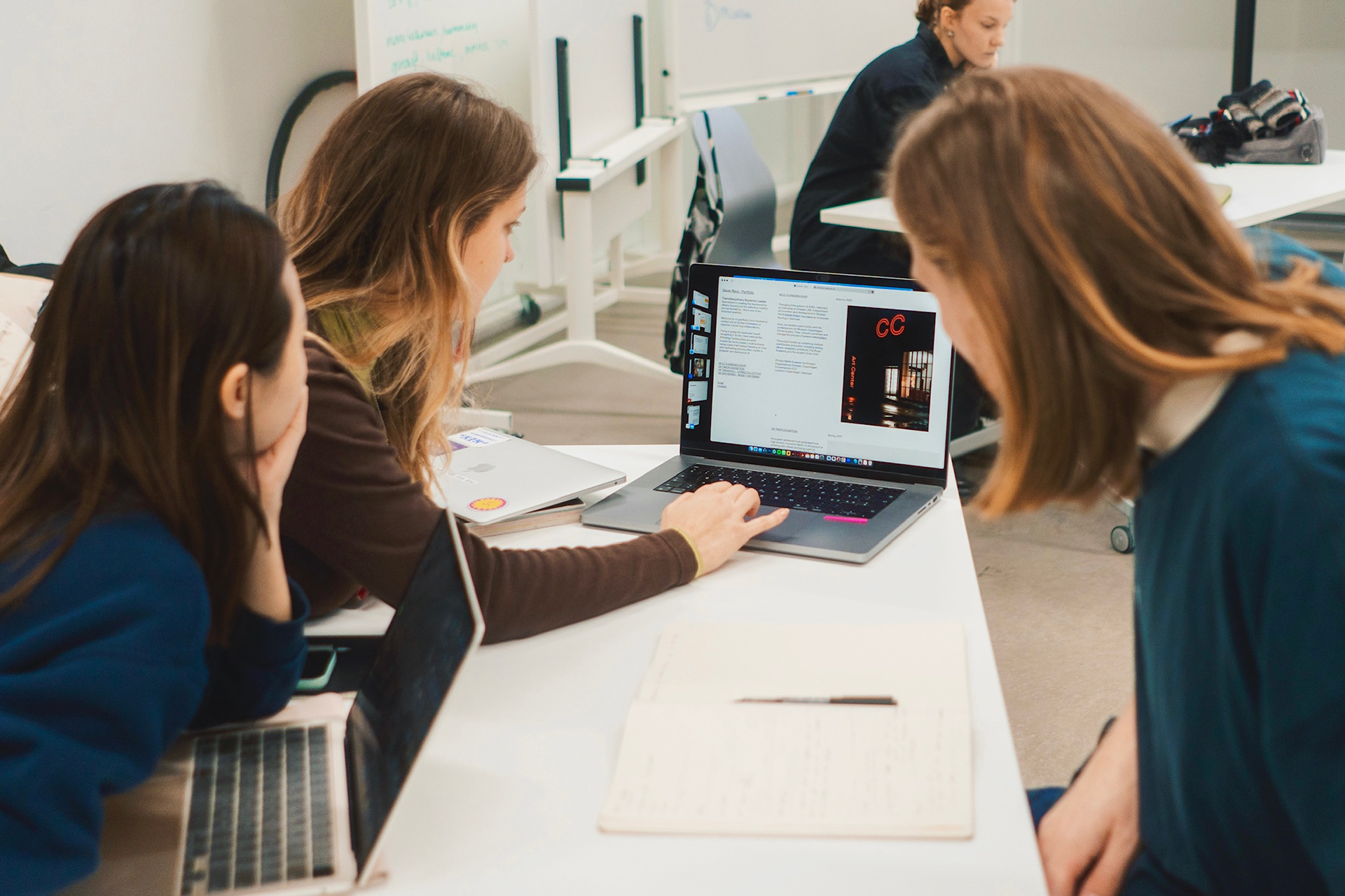
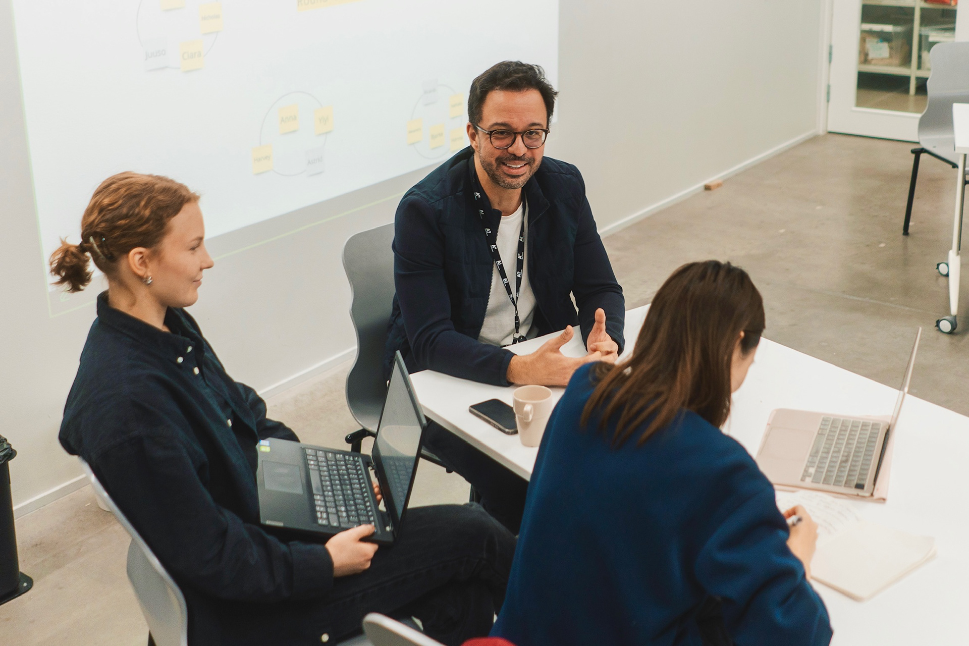
Another key component of the new direction for the NoVA brand was the creation of a library of professional photographs: a flexible visual asset bank that could support a wide range of materials, from social media content to the website and printed leaflets. To start building this, I documented one of NoVA’s hybrid lectures, where students from both universities were interacting with each other and their mentors.