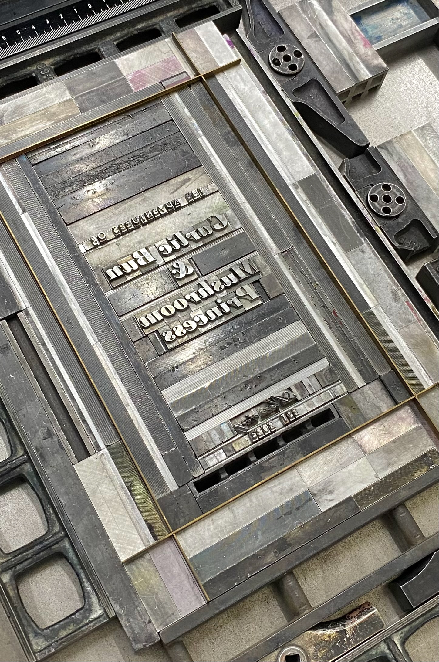
Gaining a deep understanding of digital graphic design often involves revisiting the craft’s roots. Working with letterpress has provided me with a deeper understanding of concepts such as kerning, spacing, and composition through a hands-on, tactile approach. These experiments have allowed me to view graphic design from a new perspective, offering insights that are difficult to achieve digitally.
Letterpress demands time and patience, as even simple compositions can take several days to complete. The process is meditative, offering a deeper connection to the design elements and an appreciation for the precision required.
Part 1: Business cards
During the introductory letterpress workshop, I completed two distinct projects. The first consisted on crafting my own business cards. I combined modern and traditional techniques by printing the main design with an inkjet printer and using letterpress stamps to deboss “invisible” text on one side. By applying extra pressure without ink, the text becomes subtly visible on both sides of the card. However, this technique comes with limitations, as too much pressure risks damaging both the paper and the lead stamps, requiring a delicate balance for the perfect result. It was also challenging to align the ink-jet composition with the blind stamping, since there is no precise way to center it and it becomes a matter of trial and error.
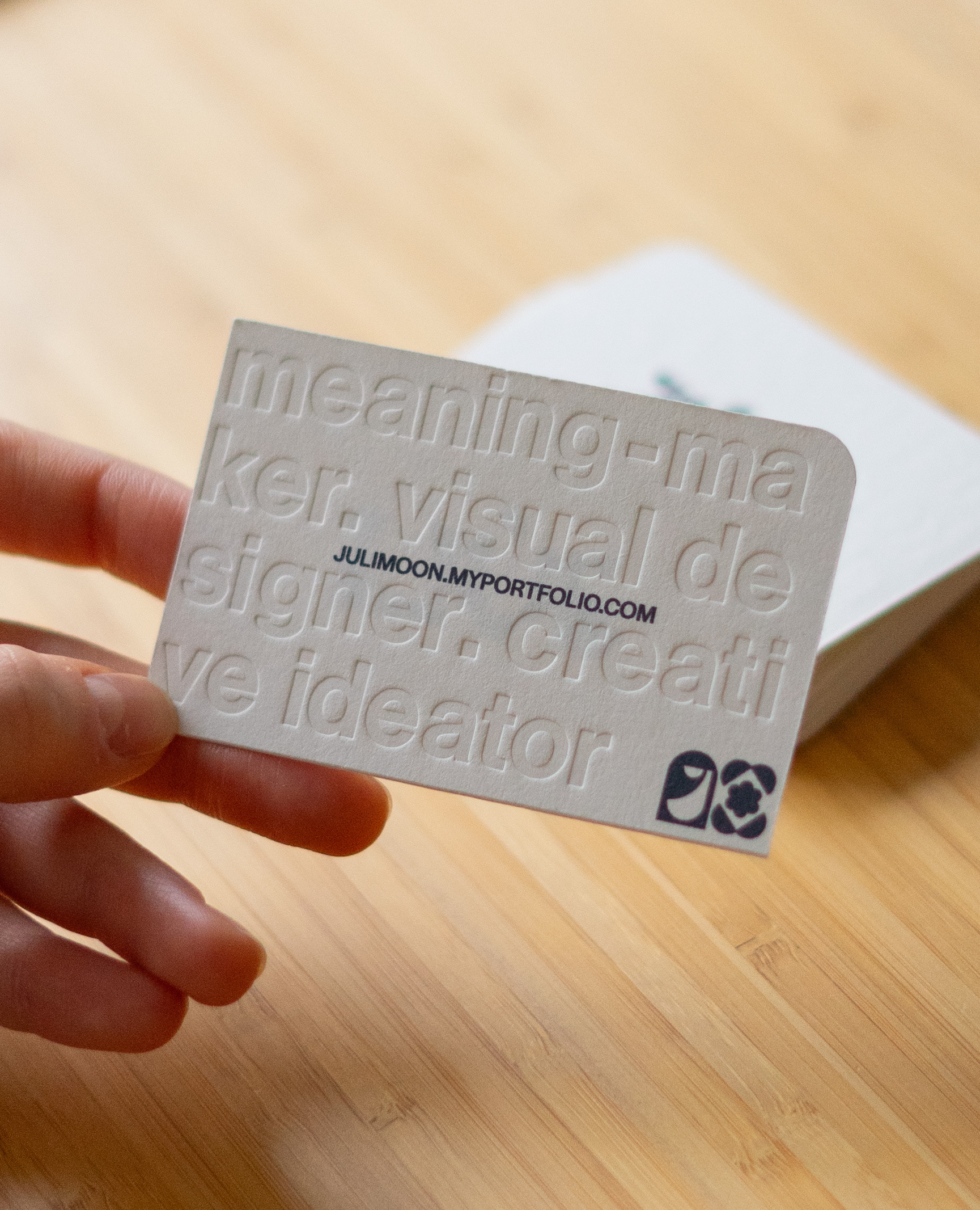
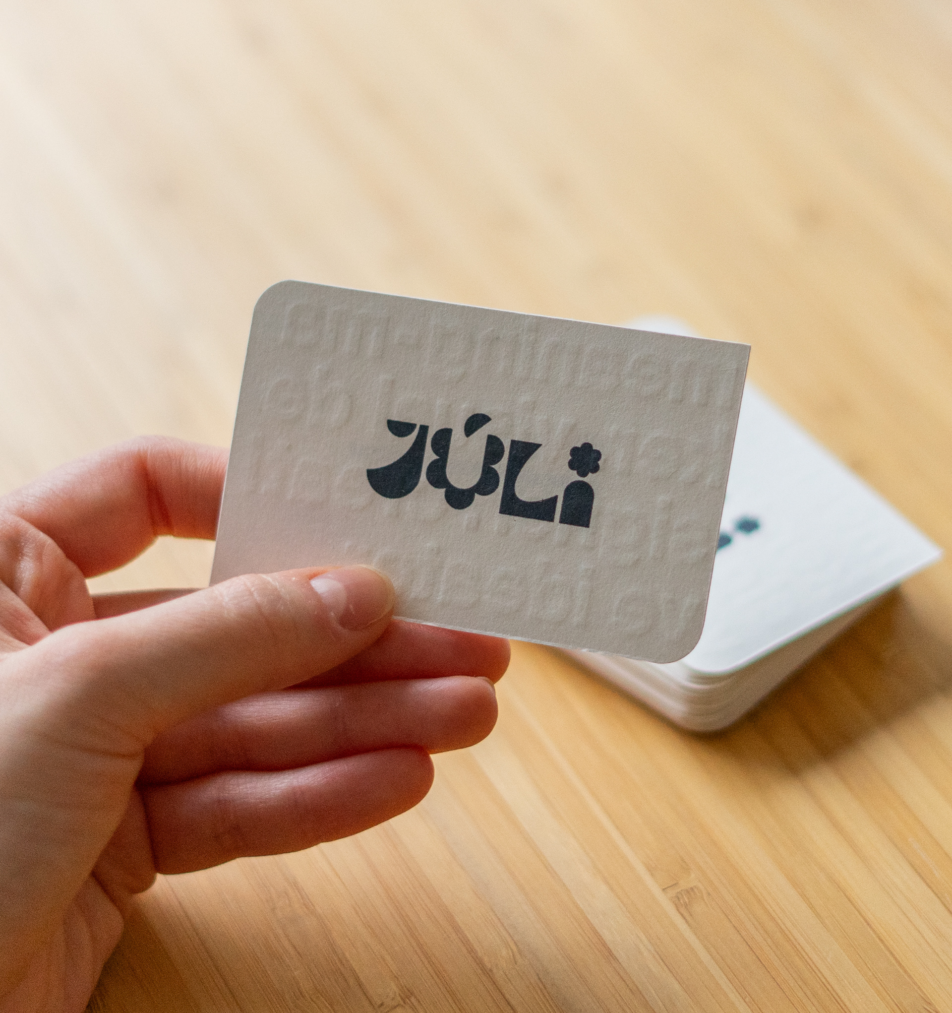
I designed these business cards to reflect my essence as a designer in a fun and engaging way. Along with my logo and website, I incorporated the words "meaning-maker," "visual designer," and "creative ideator" through the blind press technique to add an intriguing, tactile element. These words capture how I define myself professionally, and the subtle debossing makes the design more dynamic and memorable without overwhelming it visually.
Part 2: Poster
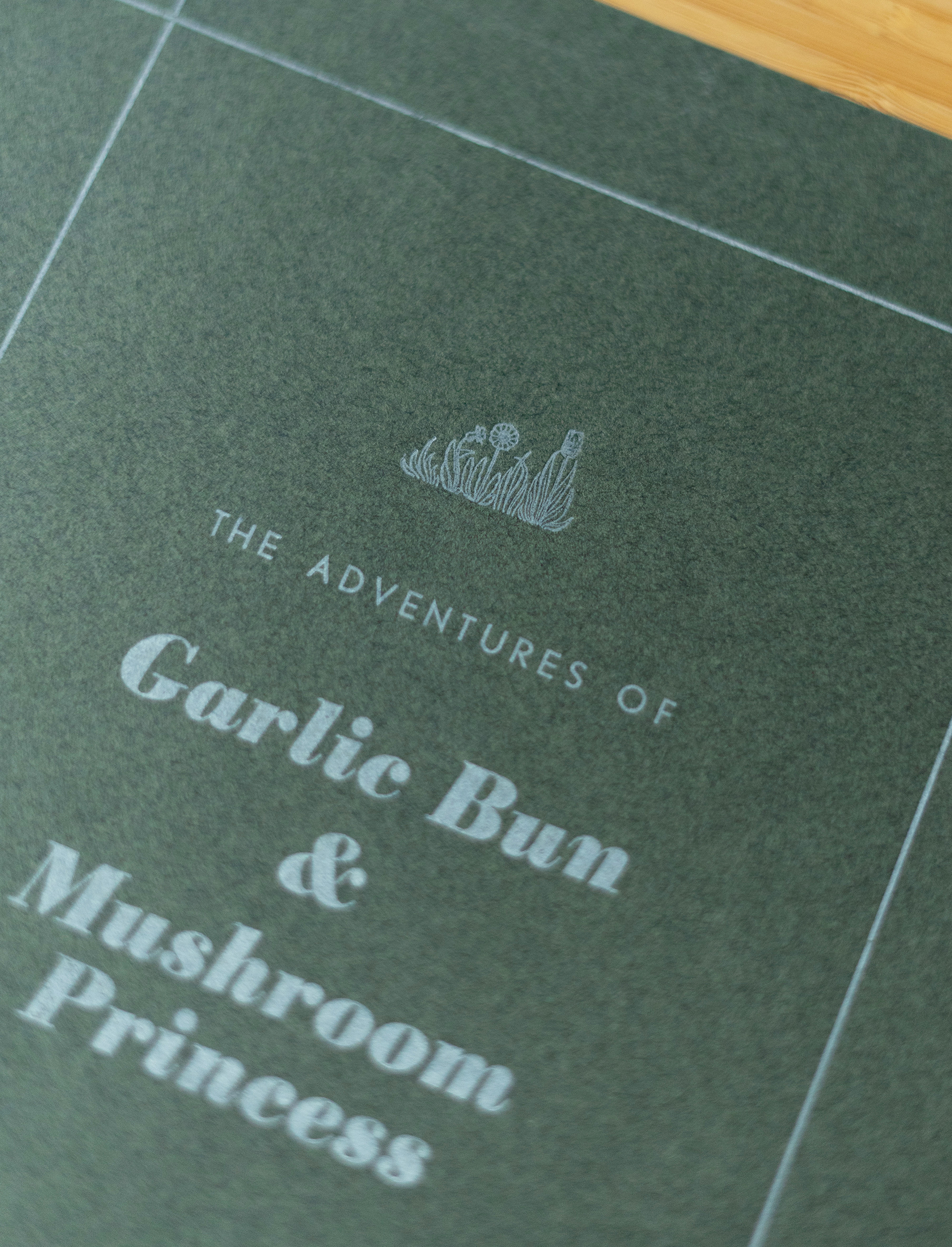
For the second project, I constructed an A4 layout for a poster solely using letterpress stamps. Unlike digital design, where empty spaces remain blank, letterpress requires every part of the layout to be meticulously filled, even the negative space. I was particularly captivated by the small illustrated stamps and the unexpected level of detail they transferred onto the paper.
With guidance from the workshop master, I formulated a custom mint-colored ink and applied it to the selected green paper to create the final print.
