

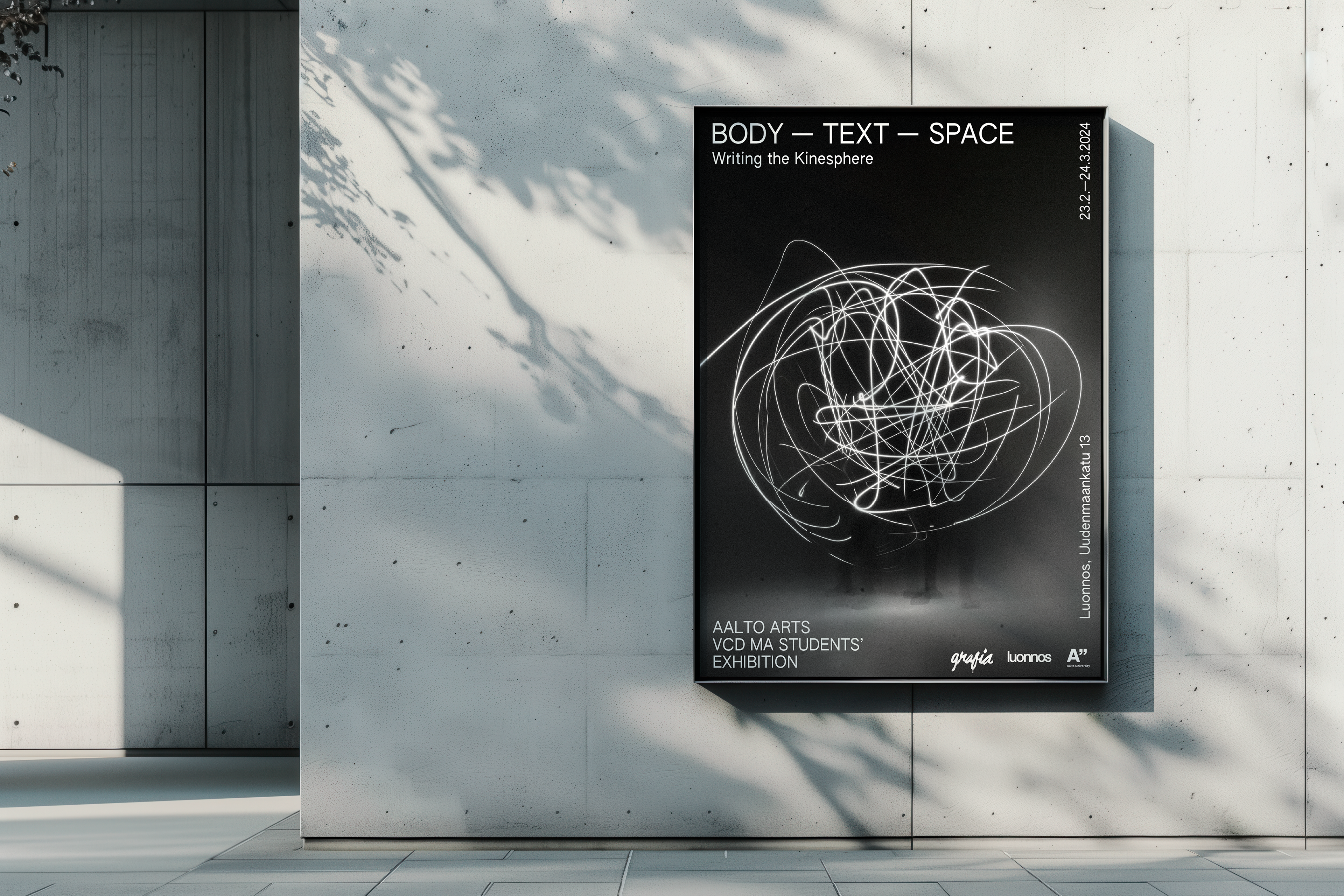
I collaborated with five other designers to create the visual identity and graphics for "body—text—space", an exhibition by Visual Communication Design students at Aalto University. In addition to my design contributions, I also participated as an exhibiting artist. The exhibition was the outcome of the course Design as Writing, taught by Arja Karhumaa.
The exploration between body, text, and space was inspired by Rudolf Laban's concept of kinesphere, which refers to the sphere of a person's body reached by their limbs.
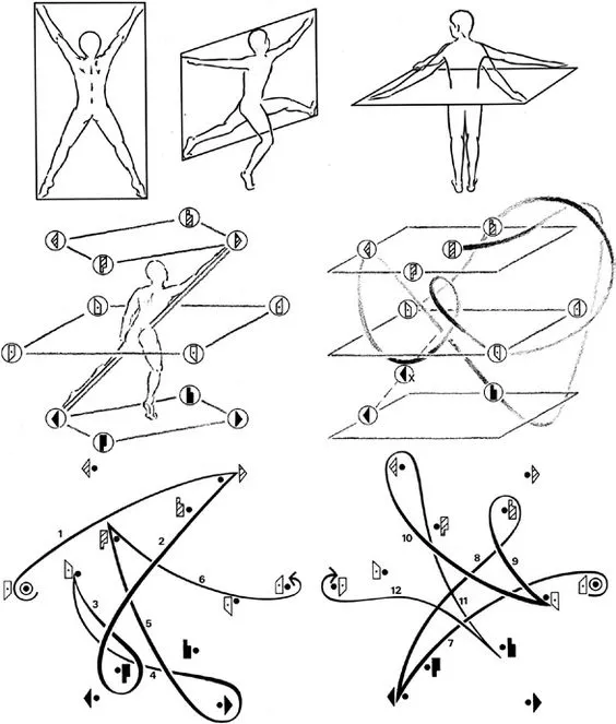
The exhibition explored the concept of kinesphere through 22 works responding to the question: What does the body know about writing? Each piece centered around a single sentence, developed collaboratively through a playful writing process. Participants rewrote and transformed sentences through creative writing exercises, often altering their original meaning entirely. For the final works, each student had complete freedom in how they wrote their sentence, under one condition: it could not be created using digital tools.
(Failed) typeface
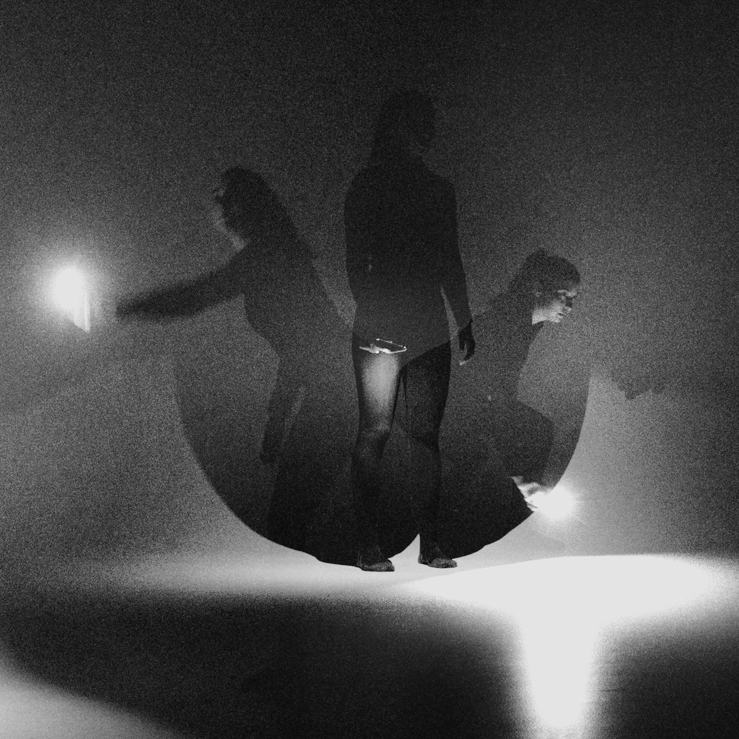

Inspired by the concept of the kinesphere, we experimented with long-exposure photography to capture the movement of light as our bodies traced letterforms in the air. I photographed a participant as she moved within her kinesphere, drawing letter shapes with a flashlight. We then vectorized these light traces to create our custom typeface.

While the outcomes from the photoshoot were satisfactory, none of the letters were used for the visual identity as they did not work well from an aesthetic point of view. However, some of the test photos we took ended up being used as the base for the logo.
We found meaning in
our failed experiment.

Visual identity
The final visual identity was modular and playful yet minimalistic, incorporating elements from our failed photographic experiments in an unexpected way. As a team, we selected an accent color to complement the black-and-white palette and chose a suitable font to unify the design. The identity was applied across both printed materials and digital graphics for social media, ensuring a cohesive visual presence for the exhibition.


Window decal
I collaborated with Merle Karp to design the window decal for the exhibition, building on the previously established visual identity.


Personal work
For my personal work in the exhibition, I combined multiple techniques in my creative process. My final sentence was: mold my mind and leave the prints of your recomposed trace.
To reference leaving prints, I first stamped the entire sentence using Letraset letters. Then, in a second iteration, I cut this composition into strips (twice) and wove them together, creating a paper-based textile. In this woven version, the text becomes unreadable, transforming instead into a visual texture that embodies the idea of a recomposed trace.


